
Let us establish one thing before I began: colour blindness is a real condition, lack of style is not. Anyone who claims being “colour blind” because they lack fashion sense is a moron. Sensitivity rules apply: if you don’t have that condition, don’t claim you do. It’s rude.
God loves beauty. God made beauty. Beauty can be found in every colours of the rainbow and every colour of nature. Unfortunately, some people seem to believe that colour-matching should be left to God and spend no time on trying their hands at it themselves. Wether it be scarves, clothing, makeup: some things go together and some don’t. Please! As anyone who’s ever tried buying paint knows, there are many MANY colours out there, so I will try and help you make sense of it all by giving you some simple rules of colour-matching.
 RULE 1: Learn your warm and your cold
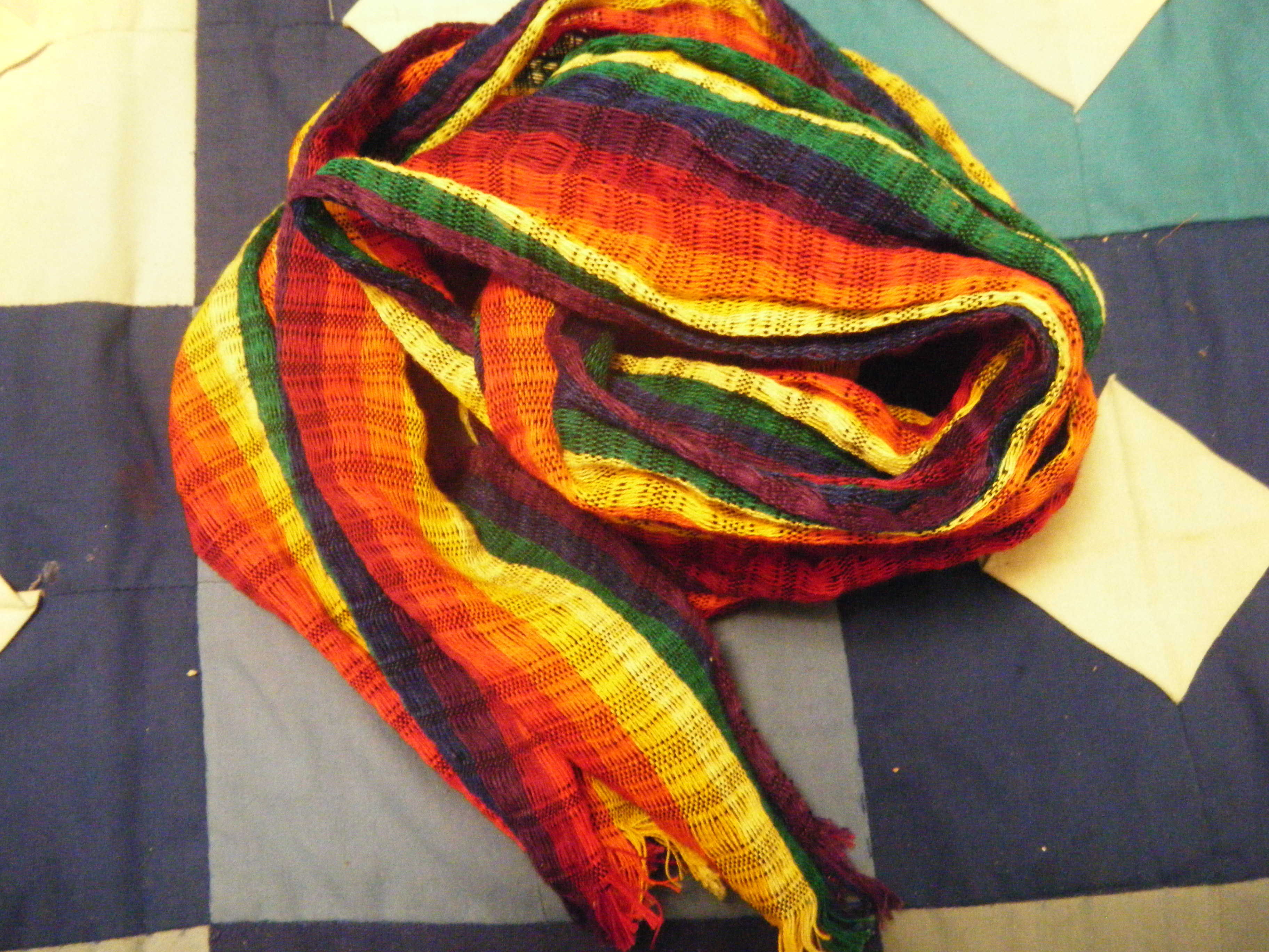
Colours are usually divided between warm and cold colours: Reds, Oranges, and Yellows are warm colours and Greens, Blues and Purples are cold colours. Browns and Pinks are warm, Greys are cold. Black and White can really be placed in either. I usually advise to stick to either warm or cold colours together. If you want a striking mixed-palette effect, go opposites: red with green, orange with blue or yellow with purple.
RULE 2: Light for light, dark for dark
Colours can go from pastel (pale) to bright to dark. When chosing your colour palette, try and stick with one. A bright purple will go well with a bright green or a bright blue, a dark red with a dark yellow, etc. Black and White can be used with any “shade” of colours, but of course white works better with bright or lighter, and black works better with darker.The only exception to this rule is neon… just don’t do all neons or you will be thrown back to the 90s. And really, neons? why?
RULE 3: One patern for one plain
I know some great coordinators can pull off two patterns expertly buuuuuuut this should be left for expert coordinators. Please wait until you feel expert enough before trying this yourself. If you MUST mix patterns, the general rule is to have one big patterns for on e small pattern. For example, a suit with large stripes with a tie with polka dots. I would still advise to have one plain in there such as a plain dress shirt to balance the look. With head scarf, this is especially true, if you choose one scarf which has patterns, you should pick an underscarf with little to no pattern. If you are using more than one scarf, make sure to alternate plain and pattern, otherwise you will find yourself overwhelmed by your head scarf!
RULE 4: Accentuate one feature at a time
This rule applies perfectly to makeup, accentuate your eyes or your lips, never both at once, or you’ll look clownish. However, this rule can also help take a look from pretty to outstanding when applied to clothes. For example, wearing all white with a blue shirt or greys and blacks with red accessories. Playing up one part of your attire is a sure fire way of getting the attention where you want it to: Bright pants, neutral shirt; bright shirt, neutral pants; bright accessories, neutral clothing.
